This is a difficult part of gamedev for me. I tell myself “I’m not a designer” all the time, but I know the basic principles and how to use free tools that help point me in the right direction.
I began the UI out of necessity for testing back-end functionality. I had hooked up the abilities to increase the player’s XP, income and golden tickets, the news feed and the basics of inventory. The data was loading in and outputting to the console perfectly, but I needed some buttons to start passing data into and out of the game.
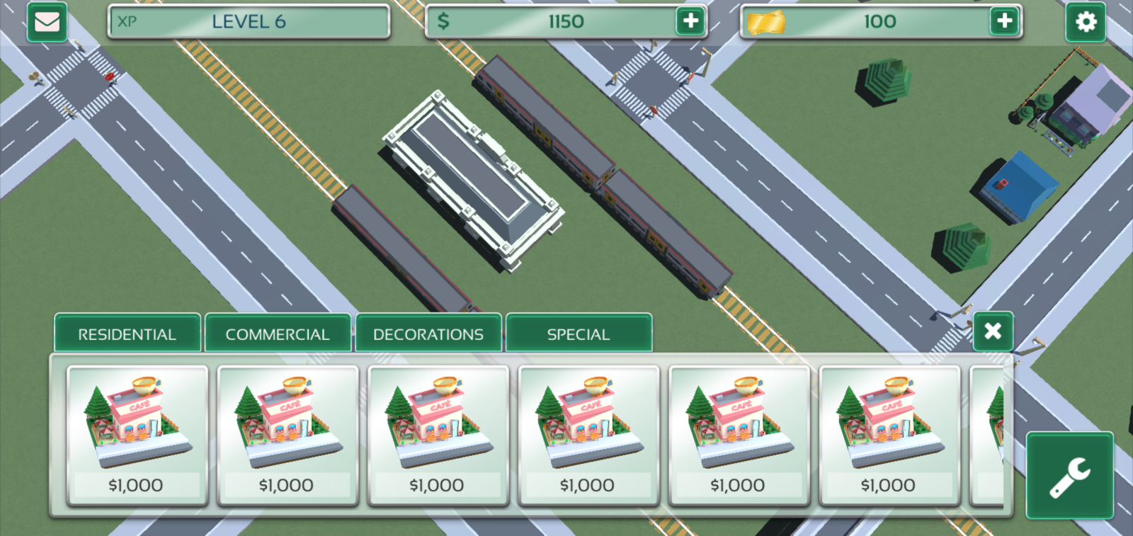
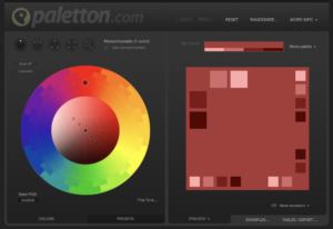
I needed a few buttons, some simple windows, and other UI elements. I remembered that I had actually purchased a UI asset from the asset store last year that I never used. I opened up the package and found the Photoshop files where I could style away as I pleased. Using the paletton.com color scheme picker, I created a nice looking green UI treatment, imported the assets and hooked up the code.

Immediately I thought “this is blending in way too much”. Without showing it around to get feedback, I started selecting other color schemes to see what might work.
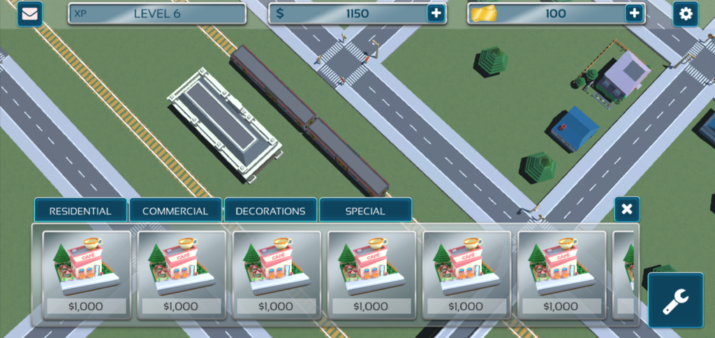
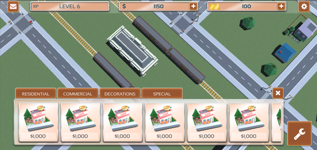

I’ve gotten mixed feedback from Twitter and Instagram (of course). It seems like the Brown UI is a favorite, but everyone has a “…however” attached to it. I agree with others that say it may be a bit too striking and could take away from the game visuals.
The purple UI is pretty and doesn’t pop out as much as the brown, but it doesn’t necessarily compliment the game visuals themselves….and it feels a bit heavy. Lightening this up would start getting into brighter pinks, which would not be a pleasing UI.
The blue UI is probably the most pleasing to the eye as there is no harshness to it, it’s relatively subtle and is a common and familiar UI color scheme that I’ve seen many times.
So what’s the verdict? I’m considering building them all in and letting players choose their style as a personalization feature, but that’s still under consideration (and I would still need a default). Let me know your thoughts in the comments below, and don’t forget to follow me on Twitter, Facebook, and Reddit!
Btw, I like the brown one…

